Walking Distance: Googleplex Edition

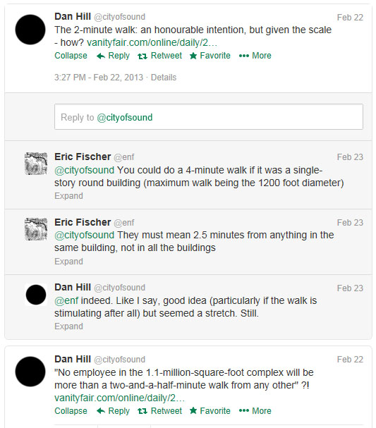
Saw the following on twitter from the always-awesome Dan Hill and couldn’t resist educating the public against their will:

For complete accuracy, here is the quote from the article mentioned:

The layout of bent rectangles, then, emerged out of the company’s insistence on a floor plan that would maximize what Radcliffe called “casual collisions of the work force.” No employee in the 1.1-million-square-foot complex will be more than a two-and-a-half-minute walk from any other, according to Radcliffe. “You can’t schedule innovation,” he said. “We want to create opportunities for people to have ideas and be able to turn to others right there and say, ‘What do you think of this?’”

First, the historical angle. In the history of the modern office block, optimizing for walk distance is one of the earliest common problems. It was one of the main design drivers behind the form of the Pentagon; despite containing 6.6 million square feet and 17.5 miles of corridors, one can walk between any two points in 7 minutes or less.


Mission Accomplished


There have been multiple attempts over the years to more finely determine optimal walking solutions, the most notable of which was the work of Philip Tabor and Tom Willoughby at Cambridge University in 1972, using a combination of graph theory and a traveling salesman algorithm. This research ultimately concluded that quantifiably optimized architectural solutions were not possible (at least on nongraphic computer workstations in the early 70’s.) More important than this “negative result” was the reason this problem was chosen in the first place. It was chosen because it was a)straightforward, and b)didn’t require a computer with a screen (IBM having rejected their application for a graphical computer system as there were more “important” researchers ahead of them in line). Finally, the reason for looking at mathematical optimization in the first place was a little disingenuous – at that time at CU “hard science” projects were being worked on largely to qualify architectural work for scientific grant money. For a more detailed version of this story, I highly recommend the article “Fenland Tech” by Sean Keller.


Tabor/Willoughby Topology Diagram


Ultimately, the idea of walk optimization is a pretty silly one, not only because optimization of an architectural design unilaterally against a single criteria is a silly thing to do, but also because this problem has been solved non-architecturally, with intercoms and voicemail and faxes and email and videoconferencing and whatever else we think up to connect two people (as if we need more options).

However, I am certain that our good friends at NBBJ are aware, at least implicitly, of all of this. Indeed, if the following video is any indicator, Marc Syp et al were far more interested in daylighting than walk distance:

Architecture: Daylight Gaming Engine from Marc Syp on Vimeo.

So why the quote? I suspect that what they were really speaking about walkability in the same way that we do when talking about walkable cities, a “walkable radius” between addresses. And given that directive, it seems feasible. 1.1 million square feet, at 4 stories, makes a circular building with a radius just shy of 300 feet. Given a 3.1 mph walk speed, this circle could be traversed in about 2 minutes and 15 seconds. And yes, I know we are discounting vertical transportation time, and yes, I do suppose that this problem is better solved using taxicab geometry rather than straight lines, but I think I’ve been pendantic enough already, don’t you?

So, boiled down, what this metric or goal is really stating is “please keep the buildings clustered relatively close together and place the entries to facilitate walking between them easily.” Which is not exactly Earth-shattering– in fact the idea of lively communal spaces adjacent to circulation seems to be a fairly common Silicon Valley theme, from Apple’s minimalist doughnut to my own employer’s work for Facebook, Gensler, Microsoft, and, more recently, Nvidia.

Put simply, what the above quote is attempting to relate is that the characteristics we value in cities, towns, and theme parks also come in quite handy in suburban office conglomerations. While GChat is great, incentivising physical movement not only promotes better health and increases the chances of serendipitous contact, but a face to face conversation has substantially better bandwidth and lower latency. It’s not dissimilar to this xkcd what if post on FedEx — no matter how fast the internet gets, you will always be able to move the contents of your brain from one place to another faster by walking it there.

Walking Distance: Googleplex Edition

DesignScript: Thoughts and Unfounded Speculations

This year my (generous) employer sent me to Autodesk University, where I loaded up on design computation and BIM classes for four straight days. The first day was entirely taken up by a technology preview of DesignScript, where Robert Aish and others from Autodesk and Buro Happold presented the underpinning logic, some practical examples and attempted to help us get a handle on the syntax and functions. Below is a (thankfully edited) digest of my notes from the class. Note: much of what is listed below is guesses and conjecture. I am sorry if I am wrong, feel free to correct me in the comments.

– One of the first noticable features of DS is the ability to switch at will between “Imperative” and “Associative” programming modes, which is a fairly unique feature that reminds me of the setup() and draw() portions of a processing script. Indeed the basis of the language appears to be maximum flexibility, borrowing some language features from python, and allowing functions to call “collections” of objects (essentially arraylists) as well as single objects.

– The little IDE is fairly sparse but appears to have most of the important functionality implemented. Reminds me of Processing, in a very good way. One beef – error handling is currently very opaque and rudimentary; more everyday English and specificity would go a long way for those of us that don’t program for a living :).

– It took all of thirty minutes for someone to bring up Grasshopper and another thirty for GC to be invoked. Robert Aish was very gracious about this (one of my main lessons of the day is that Mr. Aish is a fantastic, patient, enthusiastic human being). He was, howerver, a bit dismissive of Grasshopper, exhibiting a programmer’s bias against non-textual methods of programming.

– DS is still very much in early development; there were many “known issues” including the fact that it’s not currently very fast. I hit another one almost immediately; the object color methods don’t play properly with Associative mode.

– Likewise, the geometry engine is surprisingly bare bones; they just revealed that they just added surface curvature functions to help a pre-alpha tester do some test scripts! I really hope that going forward they spend as much time on geometric functions as they have on pure syntax.

– When questioned on the details of a future graphical interface, they revealed that the graphical and textual representations will work in parallel; that is, you will be able to switch between them with a 1:1 correspondence, and both will represent the same compiled or interpreted result. Sounds complicated, but if it works out this would be a pretty awesome feature.

– DS still has a “run” button. Removing it appears to be on the “to do” list, which I suppose would make DS an interpreted language? Actually given what I have said above it sounds more like David Rutten’s description of Grasshopper; the script being a visual interface to get precompiled .dll’s to talk to one another. We will have to see how this shakes out.

– DS currently spits out “dumb” AutoCAD geometry with no link back to the script – there appears to currently be no method to “load” drafted geometry into the script. Obviously this is a big need on the wishlist.

– Aish et al have stated a desire to avoid the need to “bake” geometry into the host program. Not sure why this is something to avoid. As there doesn’t appear at the moment to be a way to keep rig geometry from being expressed at runtime the current state is essentially everything being “baked.” It would be interesting if there were simple ways to group geometry into groups to change their expression appropriately.

– The three statements immediately above this one all point to the same thing – currently, immediate feedback is not a feature of DS. I know that is coming soon, it will be interesting to see what it can do when the interface has more interactivity.

– The plugins already implemented (Robot, SmartForm formfinding by Buro Happold, Ecotect etc) show one major advantage of DS over similar interfaces- it appears to be very easy to extend with currently written libraries of code. This could be the feature that makes this language take off, particularly if Autodesk keeps adding analysis functions based on their current software. Once again, reminds me of Processing in a very positive way.

That’s what I have. I agree with a lot of what Daniel Davis said almost a year and a half ago, notably that my biggest fear is that slow development and a slower release schedule is keeping Aish and Autodesk from “failing faster” and will prevent this tool from being as powerful and popular as it deserves to be. It’s worrisome how much is still on the wishlist after multiple years of development. That being said, if this becomes the underlying architecture for all scripting in Autodesk products that would be fantastic – the language is clear, useful, powerful, and rewards guessing – I’m not lying when I say it kept reminding me of python and Processing. So, if some Autodesk Senior VP of something or other is reading this blog (ha!) – listen, give this team some more people and more money, light a fire and let’s get this thing out of the labs and into your software!

DesignScript: Thoughts and Unfounded Speculations

Andrew Heumann / thetic / tweet2form : futures in visualization

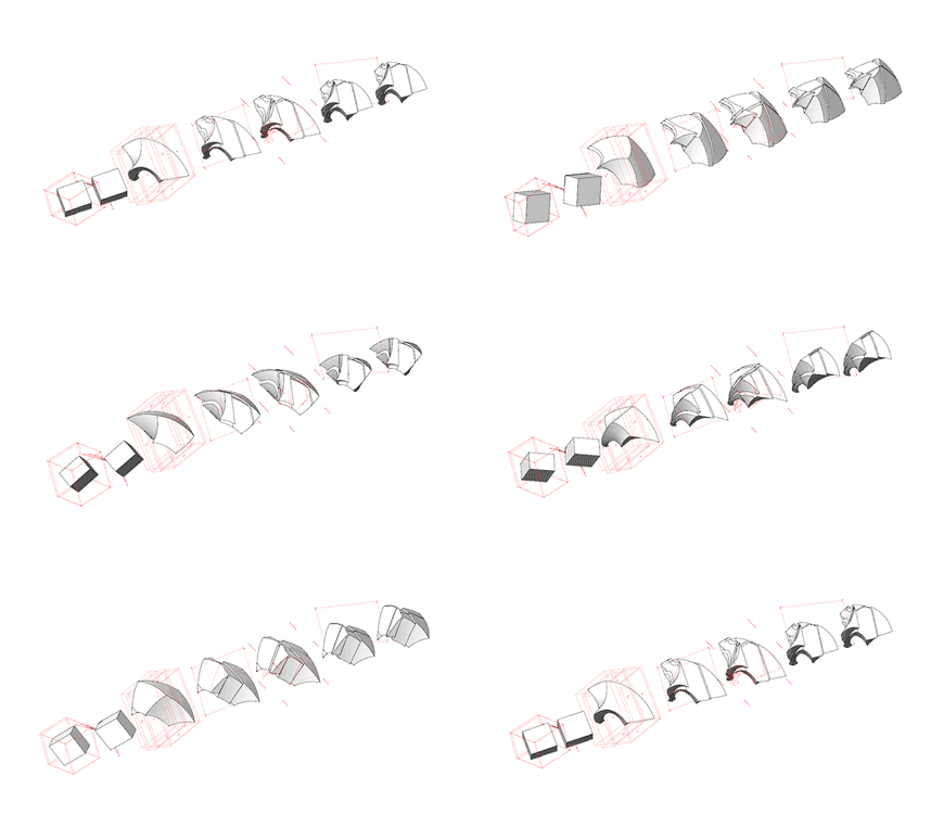
Andrew Heumann released a new tool/toy/tweetbot called tweet2form today. While the bot is delightful in its own right, what I really want to highlight is the visual ouput of the process. Specifically, this image:

This image displays many layers of information, enough that much of the alogrithmic method can be teased out just by paying close attention. First, the use of small multiples shows each step in the generative process. Second, overlaid iconography reveals the details of each formal step. Finally, the animation itself shows these steps over a starting mass that is rotated through several degrees of freedom, revealing the possibilies inherent in the schema. Oh, and it’s also quite beautiful. Tufte should be proud.

If your process uses an algorithmic form-finding method than this level of clarity and openness should make you sit up straight and pay attention. Too frequently in digital work computation is used as a method of obfuscation rather than as a true extension of human extension. If you can’t explain what your script or definition is doing, and what it would do given a different set of inputs, the results are probably not worth discussing until you have figured it out. This kind of work is just a shot across the bow: the bar has been lifted.

Andrew Heumann / thetic / tweet2form : futures in visualization

CALIT2

I recently, as one of the side benefits of a current project at Gensler, got to visit the visualization labs at Calit2 at UCSD, in particular those dealing with large scale screen arrays, both in 2d and 3d (with the aid of very stylish polarizing glasses). The technology we demoed ran a rather tight gamut from hemispherical projection rooms with infra-red head tracking, to gigantic arrays of networked LCD panels. That is to say, groups of display devices with sophisticated stitching software that knows how they are laid out and where the viewer might be located. I’m not trying to downplay how cool this all was (and it was cool), but the topic of conversation that kept coming up with each subsequent display was how the actual hardware was anything but cutting edge. Consumer electronics are now so powerful that these gigantic, room size displays were made of components that could be bought at your neighborhood big box store (and, in fact, some of them had been. In true engineer fashion, they hadn’t removed the stickers yet.) The stitching software itself was running on three-year old gaming PCs. At one point, it was pointed out that currently it is cheaper to use arrays of LCD screens as an interior finish than it is to put up back-painted glass.

Some other things were also apparent. One is that the screen has finally caught up and surpassed the projector as a medium for environmental media. I don’t know why I didn’t notice this earlier. Another is that the power of this kind of environment is very dependent on being interoperable and omnivorous – it has to communicate with everything and take whatever format you can throw at it (it did the latter very well, the former being the missing piece of the puzzle).

This kind of technology is mature, inexpensive, and eye-catching, which is why I fully expect for it to be near-ubiquitous well before we get our hands on a Google self-driving car (although likely after we see someone wearing Google glasses run into a light pole).

Finally, a note on museums: it seems to me that, after decades of disappointing edutainment at science and technology museums, virtual displays might actually be close to beating out reality in certain situations. Not sure how I feel about that one. I’d probably prefer for my kids to look at real fish.

CALIT2

Miiiiiiillllliiiiiippppeeeeedddddeeee

While I wasn’t looking, sawapan have released a suite of Grasshopper components they are calling “Millipede.” This is a diverse suite including finite element analysis, topology optimization, fourier transforms, eigenvalue partitioning, and much much more! I got to play with the alpha or beta versions of many of these components in Panagiotis’ classes at the GSD and they are powerful stuff.
http://www.sawapan.eu/

Miiiiiiillllliiiiiippppeeeeedddddeeee

The Nurbs-Fabrication Complex

… use computation, but stop fucking talking about it. Your project isn’t any better because you told me it was scripted from the secret code found in the lost book of the Bible handed to you by your Merovingian great grandmother. Nor because you spent a semester producing the most intricate parametric network ever seen by man, & still ended up with three crumpled potatoes in glossy grey.
(Mark Gage, “Project Mayhem”, Fulcrum, Issue 18, June 2011. Daniel Davis‘ “Quote of the Year 2011”)

For many, the idea of computation in architecture is synonymous with the use of form that is complex in very specific ways. These forms exist in a sweet spot that combines easy description via a parametric method (B-Splines, subdivision, Voronoi methods) with a dynamic graphic perspective image. In some, but not all, of these projects, additional limitations to the form may exist to ensure that the floors can be walked on, and that the structure does not collapse under its own weight. To highlight the formal dynamism, the chosen rendering method usually involves either a monolithic glossy grey appearance that has virtually no analogue in physical reality, or a similarly impossible ghostly transparency.

A great deal of mental energy is spent figuring out the proper way to derive these shapes, but even more is spent developing ways to construct them. Virtually every advanced fabrication project in academic architectural circles is devoted to novel methods to construct forms that are curved in two directions, whether through the digital generation of formwork, novel methods of panelization, curved origami, giant robot hot-wire cutters, or (if you are appropriately old-school) revisiting traditional thin-shell construction methods. These methods typically involve one or more of the following techniques – sophisticated automation, full size templates, or colossal quantities of volunteer hand laborers. Usually it is some combination of all three. More frequently, mock-up is built at a smaller scale, ideally a scale that allows for the actual connection of the members and panels to be made using methods that cannot be used in full scale construction – glue, zip ties, or slot-and-tab joinery. Usually it is a combination of all three.

Now, I have no problem with either of the types of projects mentioned above. Even after overexposure, I find a well-done architecture of complex surfaces to be engaging and thrilling, and display an admirable geometric virtuosity. As a postmodern apologist, I am thrilled at the graphic and media possibilities that some of these projects show. Likewise, assemblage projects are not only cool looking (particularly if they light up) but are an invaluable way to explore the intersection of idea geometry with physical reality.

My concern is that the two kinds of projects listed above – finding ways to design with complex surfaces, and finding ways to build the same – form a feedback loop that absorbs all of the thought and consideration of an academic group. Designing these forms suggests that time be spent figuring out how to construct them. Discovering novel ways to construct complex forms gives further credence to the idea that these forms are the sole future of design. This has become a tautology that we have learned to live with. It is implicitly assumed that you have two choices in engaging design culture – to join this computational circle, or to ignore or reject it.

What this obscures is the infinite other ways that technology could transform or inform architectural design and practice. Communication, interface, interaction, clarification, comparison — non-formal possibilities are everywhere you look. And there is an incredible variety of form available that does not require the use of continuous curves or facets, that are equally amenable to computational description or interrogation. And many of these other possibilities have a much better chance of reaching widespread adoption in the physical world than the status quo, which frequently is difficult to inhabit and more difficult to construct.

If you really pay attention to how projects are currently designed, tease out the grasshopper definition or actually parse the script, you will often find some numbers at the root. These constants and variables are tweaked to get the desired result, frequently without fully understanding how they relate to the generated form (which, in review, will be referred to as “emergent”. A quick note: the word “emergent,” when discussing digital morphogenesis, should imply the use some kind of complex feedback system. Not understanding your grasshopper definition does not make your project “emergent”).

What if, instead of using random inputs to achieve a desired outcome, we instead used meaningful, rigorously collected, verified, and curated data to generate meaningful and truly emergent designs? Computational methods are data hungry, and we currently are very short on architects interested in the front end of computational techniques. Or what if we used computation to change the design environment rather than the design itself? Where are the architects interested in the tools themselves? One teacher I greatly respect describes the architect’s use of technology as being similar to bricolage. We grab whatever is near and figure out the way it fits into a scheme we have already conceived. What if, instead, we examined and altered this technology to reflect the techniques and abilities we would like to see?

Which leads us back to the quote above. The issue with what I would like to see, with treating computation as a context and not as a style, is that the designer is then forced to find meaning for the design that does not reside in the methodology itself. This is incredibly important if architecture is going to engage the outside world, and incredibly difficult if you are not accustomed to thinking about meaning in this way.

This is the point in the op-ed where the author usually acts as a doomsday prophet. I might say something like “the architectural community now has the choice between increasing solipsism and irrelevancy, or a role as an important partner in the creation of the future world.” I’m going to scale that down a bit. Architecture does not exist in a vacuum, nor does its relationship to technology or purpose in the world. The danger is not in architectural practice or design becoming irrelevant; rather, it is individual members of our community that have to make a choice: are you interested in the future, or just its image?

The Nurbs-Fabrication Complex

Centrality

Centrality is a concept that is, well, central to a lot of internet companies (ahem, Google), but hasn’t really made the prime time in the architectural community. Urban planners and architects have started to come up with various algorithms to measure this property, whether it’s to determine a “walk score” or “space syntax”. And then there was the mid century attempt to scientifically optimize walking distance in architecture, which I have written about before. As Sean Keller has pointed out in his various articles and essays about the early days of computation in architecture, eventually the results of this research into walking distance were rendered obsolete by new technologies such as intercoms and email. This is not to say that location is no longer important, however.

While the methods above might seem fairly complex, there is a very useful and easy to calculate type of centrality that requires nothing more than a familiarity with Google Maps. If you have a list of street addresses and want to figure out which is the most central to a certain domain, a simple metric called “closeness centrality” is all that is required. To figure out this value, you measure the sum total of the distances from a location to a list of target distances (for relative internal centrality, this can be to the other addresses in the initial list). The location with the smallest total is the closest and therefore the most central. I have written a bit of JavaScript that does all of the heavy lifting for you: prepares the addresses, gets the values, calculates the totals and serves up some charts and maps to illustrate the results.

This version uses travel time instead of distance, as proximity to freeways can be a major factor. As I was initially using it to find relative centrality within a cities’ boundaries, the list of target addresses were just the centers of each zip code, which also controls the results somewhat for relative density of population. I apologize for the messy code but this was my first attempt at anything asynchronous.

Here are the file locations:

HTML
JavaScript

And here are some previous versions, that use relative centrality within a list of locations, using distance as well as travel time:

Distance HTML
Distance JavaScript
Travel time HTML
Travel time JavaScript

Some disclaimers: first of all, the code is not well organized, commented, or constructed, sorry. It’s also a deprecated version of the Google Maps API (v2) as this version had some methods that were useful. If you are going to use this a lot or write your own implementation, please PLEASE get your own Gmaps API key. And I would be remiss if I didn’t mention that according to Google’s terms of service you need to display a map whenever you query the API.

This tool has a few obvious uses. One is what was mentioned above– ranking addresses by their relative centrality to one another. It’s also good, however, for comparing entire groups of addresses to one another– simply compare the grand totals. You can also use it to figure out a good “dividing line” when making zones of control for different areas (say, delivery areas for a chain of restaurants). Have fun!

Centrality

Treemapping Redux

Oldie but (apparently) a goodie today. While I’ve linked to some isolated HTML for this project, I’ve never actually blogged about my data visualization final project from last year. This project looked at using treemapping, a fairly common technique for comparing relative sizes in a hierarchical organization, as a way to visualize dynamically the program requirements for an architectural project. I’m reposting this now for two reasons:

1. I am actually using this tool at work for program analysis at the beginning of projects, and it’s turning out to have some utility, and

2. A co-worker pointed out that a NASA spinoff is actually selling a space planning consultancy with a basis in treemapping. The presentation is undeniably impressive but also to me a bit myopic – so much time is spent talking about optimization methods without any discussion of whether the set goals are even appropriate. It seems a bit silly that you would discuss reorganizing an entire campus without the possibility of changing any interior walls, for example. While the NASA tool does present a fully developed application for space planning, it ends up presenting as many new issues as it solves, issues that I didn’t even consider below as I hadn’t thought about this method used to reallocate existing space. It seems like this team needs to have a discussion with some CAFM people to figure out the true parameters of controlling space.

In any case, my research is presented below.

If you want to play with a demo, the applet is (as always) on my dropbox.

Introduction:

This project started as an attempt to use graph visualization to show the implicit room organizations of existing building plans (fig.1). Ultimately, the project shifted to treemapping architectural program documents, for reasons that will be explained below. In architectural language, the word “program” is used to describe the intended uses and requirements of a space. Thus a program document generally includes a list of required spaces and space groups, as well as details such as area, capacity, adjacency, and other general requirements. Preset architectural program documents are common for complex building types, particularly in civic projects or programs that are highly functional. For this project I have chosen to focus on a typical middle school program document, as the information is publicly available and relatively complex.
When architects are given this document, a common first step is to draw out all of the spaces required to gain an understanding of the relative sizes of not only the rooms, but the program areas and organization. This is often done manually, and often ends up such a large document that it is difficult to comprehend it in it’s totality, or remove a lot of the detail.(fig.2) The goal of this visualization was to come up a way of automating this process, to allow someone who is unacquainted with the document to gain a quick but rich understanding of the size and organization of the spaces. I also added functionality to allow the user to make notes embedded in the document, for incorporation into the project later.
Given that a plan drawing already visualizes all of the information that would be in the graph, it seemed redundant to work on my original proposal. Since program documents can be confusing and are inherently non-visual, working from the “other end” with the raw program document seemed to be more useful.

Project Proposal
Seattle Library Program Diagram

Related Work / History

Topological models of architecture have a relatively long history – one early example is work by Philip Steadman at Cambridge University in 1973 on “Graph-Theoric Representation of Architectural Arrangement.”(fig.3). This work attempted to make a “library” of all possible topological arrangements in a plan diagram for a certain number of rooms. Also of note in the same program in 1972 was the work of Philip Tabor and Tom Willoughby on walk distance optimization, using a combination of graph theory and a traveling salesman algorithm. This research ultimately concluded that quantifiably optimized architectural solutions were not possible.
With the resurgence of computational design in the last decade, there have been more attempts to visualize room organization (although most designers work on issues in geometry rather than topology). The most notable attempt recently was by the Aedas R&D team (fig.4) which used a three-dimensional graph layout to show the relationships between program areas.

Philip Steadman Adjacency Graph
AEDAS R&D Adjacency Graph Program
Tabor/Willoughby Topology Diagram

Approach

Ultimately, research into precedent and methods convinced me to shift my approach from graph visualization to treemapping. There are many examples of program adjacency diagrams in architecture, and they have a lot of use. However, generally they appear later in the design process, as a method of design itself. Program documents have much more information about the hierarchical grouping of spaces than actual adjacency; indeed, room numbering is treelike in nature, using dot notation (e.g. “Room 1.23.4”). Where adjacency is required and noted, it can be of different types – a circulatory connection, a visual connection, or simply a requirement to be physically near. This complicates the process of visualizing these requirements. Circulation space is also not typically indicated in these projects, and thus is difficult to visualize properly – in the Aedas example above, there are large “hallway” bubbles that would not have been in any program document.
Finally, I wanted to choose a visualization method that was the least suggestive spatially, to keep from the diagram being to suggestive of the final design. Architects have a history of “building the diagram” with mixed results. The best projects often purposefully mix or subvert adjacency requirements to add a sense of community or give a more engaging spatial layout. Thus, I wanted to make it clear from the outset that this tool was not a “building designer” but instead a simple method for exploring program requirements.

Data

The data chosen for this project was the middle school space requirements for the Clark County School District in tNevada. This particular document was chosen as it was easily accessible on the internet, and contained enough detail and depth to make the visualization interesting. It was also in a tabular format, within a pdf document, that I could begin working on immediately. The information I chose to work with was the space number, name, capacity, area, and quantity. The data was converted to a tab-separated value (.tsv) file to work with Processing, and also required some cleaning, primarily to change the numbering to make it more logically treelike (a space labeled 1.21.1 was changed to 1.2.1.1). This was done simply using regular expressions in a text editor (Notepad++) the .tsv file. Some errors, like misnumbered or missing parent spaces, were also corrected.

Implementation

This project was built in the Processing language, starting with the treemapping example provided by Ben Fry. This provided both the treemapping algorithm, an open source java library provided by Martin Wattenberg and HCIL, as well as some functions to help animate transitions. I also used the “Table.pde” .tsv reader and writer file that was provided for an earlier CS171 project. All of the code except for the libraries above underwent significant modification, both to the visual appearance of the map as well as the interface and functionality. The actual layout algorithm was changed to a “Squarified” layout that reduced the number of thin rectangles in the map. A detail window was also added to the right hand of the map to show the layout in outline format as well as some detail for the space on the mouse over. The labeling method was made more sophisticated, and a visualization of occupant capacity was added. Finally, the “controlP5” Processing library was used to add some notation functionality to allow the user to add notes to the document.

Results

The peer evaluations received confirmed some of my previous decisions – there was some concern that the visualization of existing plans simply duplicated and simplified the information rather than showing something new.
The system as designed works with the provided “data.tsv” file, although there is some file-selection functionality that has been commented out, as it did not work on the applet version. The file is intially displayed at the first level of detail, with the mouseover displaying some additional information to the right. Immediate child groups of the level you are at are shown with larger labels at the bottom of the space.

Clicking within the spaces opens them to reveal the child groups and rooms within. Each level down the group or room gets lighter, suggesting its depth in the tree. Area and capacity (for rooms) is also shown if it fits – capacity by drawing a darker box within the room itself. Finally, small white tags appear at the upper right hand corner of a group or room if there is a note added. The outline view at the right hand size shows a list of the groups and rooms that are visible. The mouseouver shows information about the lowest level space or room that is visible.

After the entire depth of a space has been revealed (down to room level), an additional click will zoom the treemap onto the next level down in that area. Repeated clicking will allow zooming to the lowest group level in the map. Right clicking zooms back out to parent groups, and when at the top level will “close” the groups again, hiding child groups and rooms.

Finally, hitting the enter key while hovering over a space will open a text box that will allow a user to add a note to that space. Adding a note puts a tag on the space, and a mouseover will show the note as well. Currently the model does not save the notes back to the .tsv file, however, due the the restrictions of the web applet format (the functionality exists but has been commented out).

Discussion

The strengths of this approach are the ease of interaction, and the immediacy of understanding – it gives a very quick overview of the area and ownership hierarchy in a program document. The animation of the zooming invites the user to drill down and look at certain program areas with more detail.
This approach is, however, can be seen as reductionist, as it eliminates adjacency (beyond ownership) from the diagram. The map is not user-editable, so awkward layouts cannot be changed or adjacency ideas explored. After doing this project I understand well the advantages and disadvantages of treemapping, and have been able to explore in detail the goals and implications of diagramming and visualizing architectural data early in the design process.
Future implementation goals would involve a more rich set of interactions with the data set, such as allowing modification of the size or capacity of spaces. The idea situation would be a hybrid treemap / graph layout which would allow the user to move between visualization and explore multiple dimensions of the implicit data, as well as adding linkages or spaces on the fly.

References

Ben Fry’s treemapping resource : http://www.benfry.com/writing/treemap/
Aedas R&D: http://aedasresearch.com/
History of graph theory in early computational design:
Keller, S. (2006) Fenland tech: architectural science in postwar Cambridge. Grey Room, 23:40-65.
Keller, S. (2005) Architectural Theory at the University of Cambridge, 1960-75. PhD thesis, Harvard University.

Treemapping Redux

Infant insomnia visualization

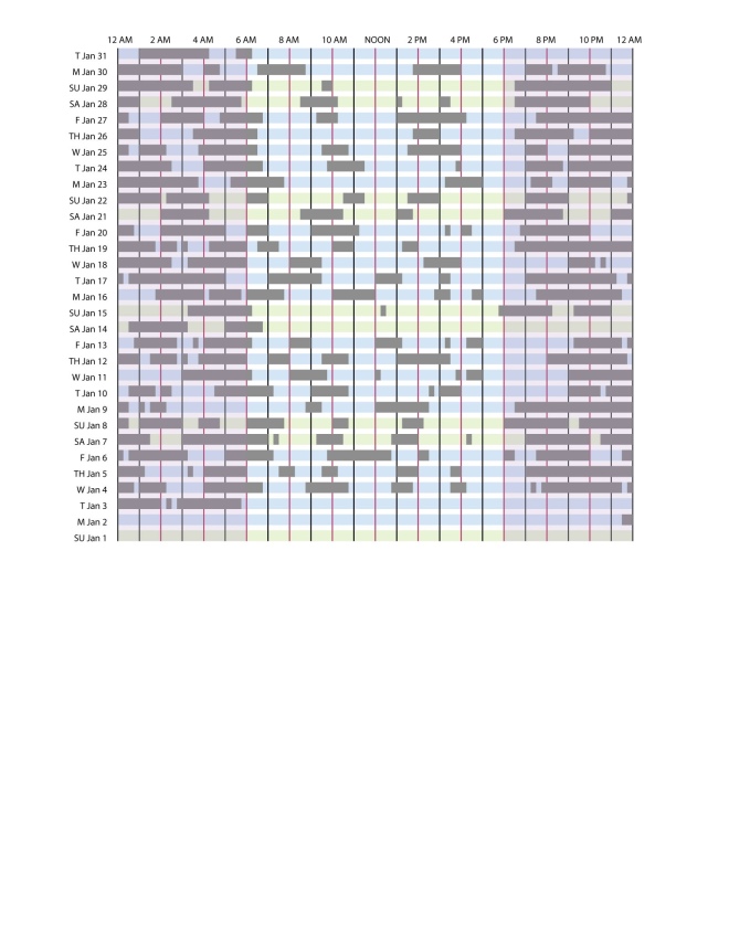
You may have noticed the three- plus month hiatus on posts here at work. Infants, particularly those that think sleeping is optional, can be a bit of a time suck. For those of you wondering how I have been spending my “free time” (ha!), my wife has prepared this lovely image:

20120131-210502.jpg

That’s right, she has Gantt charted Edie’s sleep habits. This is one of the many reasons I married my wife. Remember, all of those blank spaces at night represent lots of patting, rocking, and shushing (don’t worry, the big gaps at night are mostly just missing data. Mostly.)

And yes, this post was written on my phone while rocking and shushing my daughter back to sleep.

Infant insomnia visualization